PanaRent
A responsive web design for rental homes.
Role
UX designer, UI designer, designing a responsive website for PanaRent from concept to delivery
Tools
AdobeXD, Miro, Mural, Notion, Zoom, Adobe Illustrator, Adobe
Photoshop
Background
The real estate business is one of the biggest markets in Panamá, the political situation and the use of the dollar as local currency make not only locals but many people from all over the world come to Panamá to find a great place to live. Finding the right home with so many real estate businesses and local sellers out there makes the task difficult and slow. PanaRent is a new Panamanian company, that wants to bring specific and dedicated options for users who are looking for rental homes in the local market. They asked me to design a dedicated multi-device website, where users could find their next home. They want the solution to make the users feel the website is practical and what they need.
The Problem
The Solution
Create a responsive website that improves the user’s experience of searching and finding a new rental home, we pay close attention to adding better search options show them accurate localized results according to their real needs, and let them have better communication with the sellers to help the user find information faster and easier.
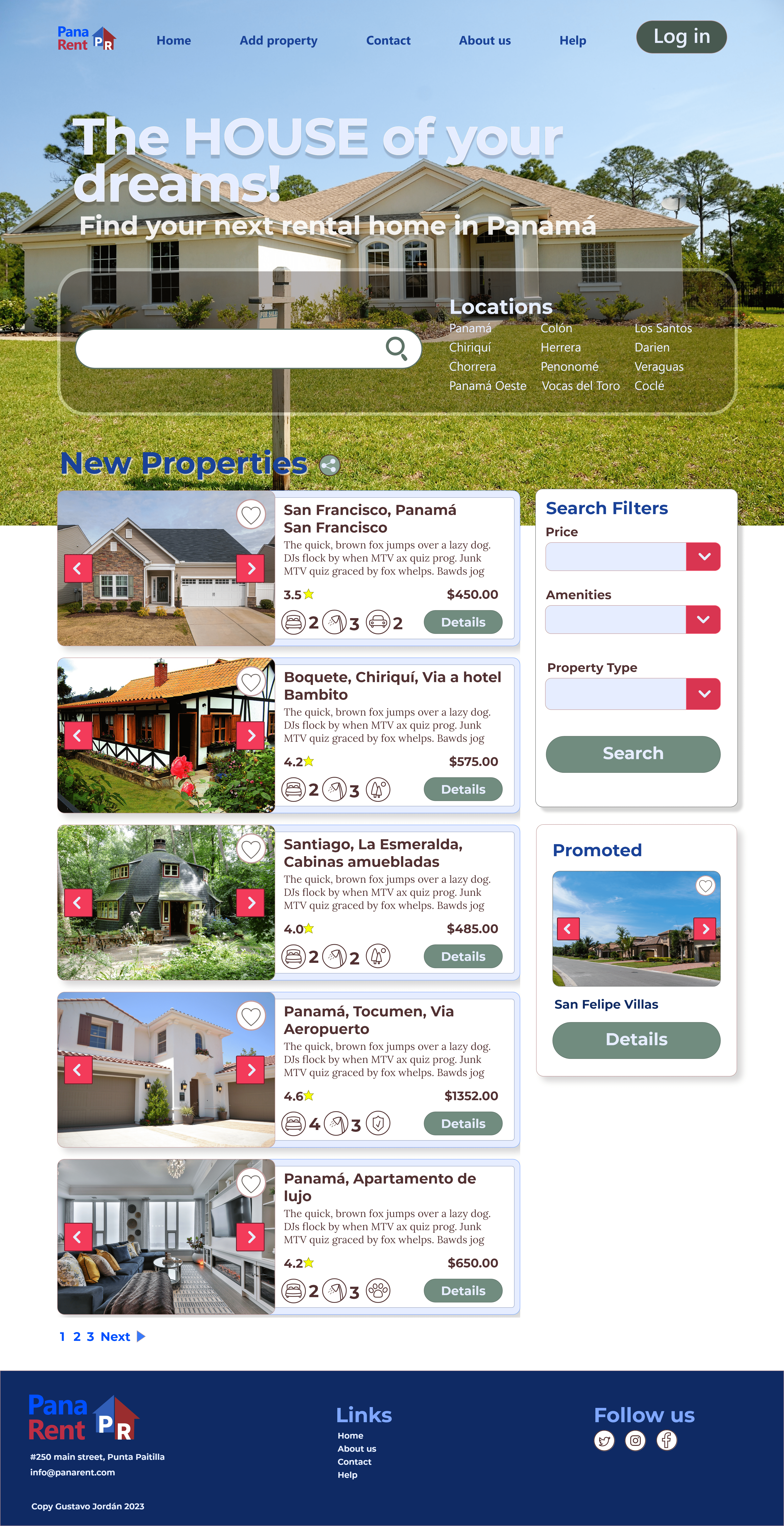
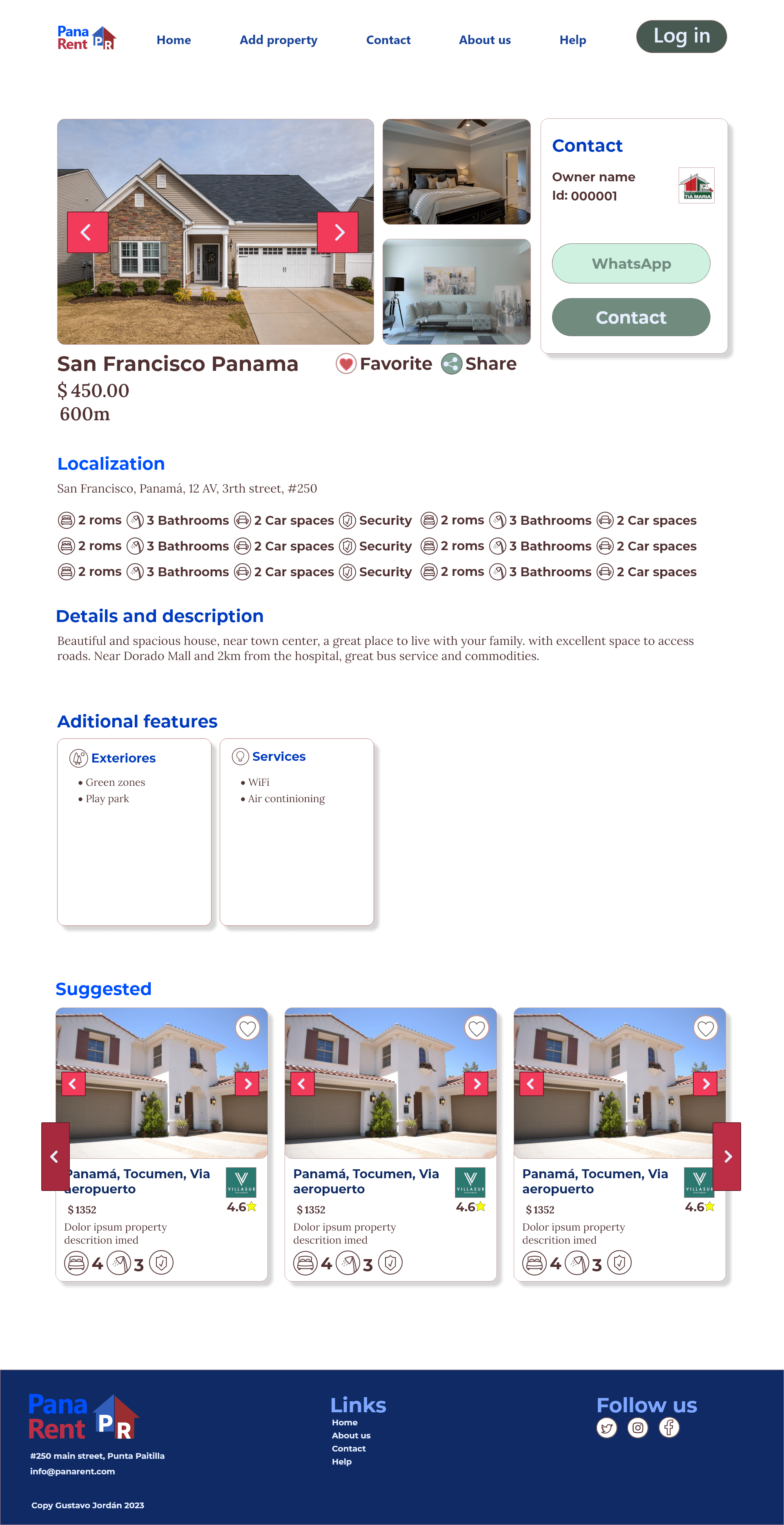
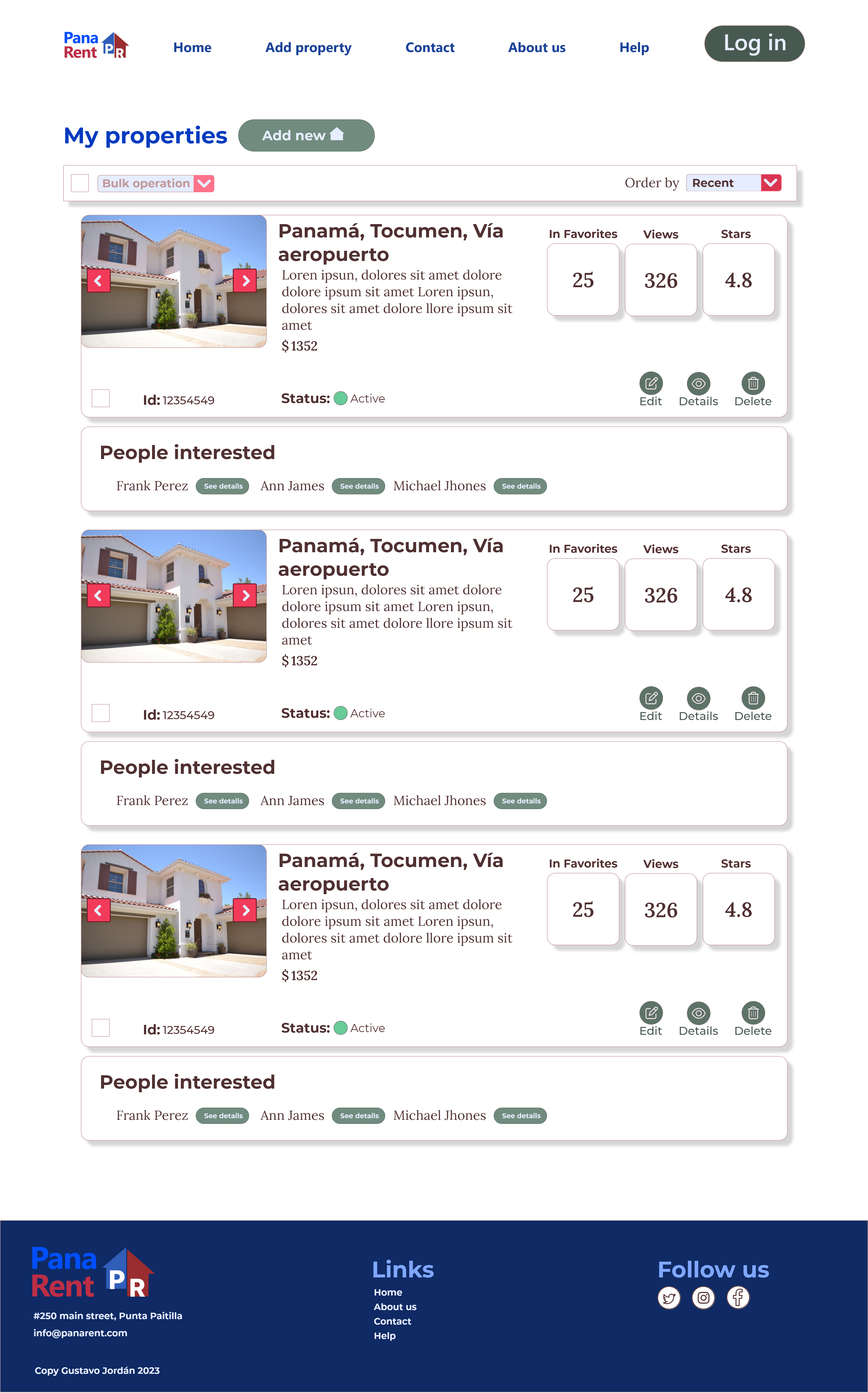
These are just some of the screens, to know my process or see the prototype please keep reading…
Research
I interviewed six users, ages 18 to 65, economically active, who rented previously and have knowledge of ways to find houses for rent, we included participants with some kind of disability in the study. Then I created user personas based on my research insights.
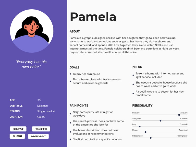
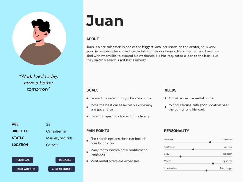
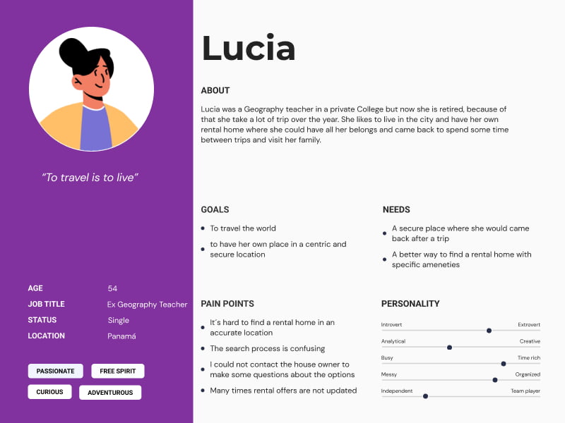
User Personas
After the interview, I created user personas, with them you avoid guessing, keep user goals and pain points in mind, and understand better your users. I synthesized our interview data to get insights and created 3 main user personas based on the results of the one-on-one interviews.
User pain points
We discovered many of our users rent their homes because it is less expensive or they like to move from place to place regularly, but they would like to have better control over their options when searching for new rental homes. From my research, I found the next pain points
Cost
User wants to find more options for rental homes on their budget
Communication
User wants to make direct questions to the property owner
Localization
The search function for the localization is oftern inacurated
Reviews
The user would like a rating system for homeowners and propertys
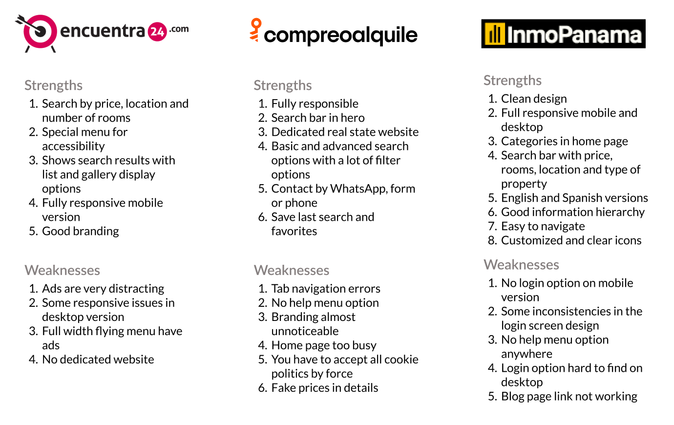
Competitive analysis
I analyzed two direct and one indirect competitor, who are trying to solve similar problems so I could understand our opportunities. I analyzed and synthesized the next discoveries
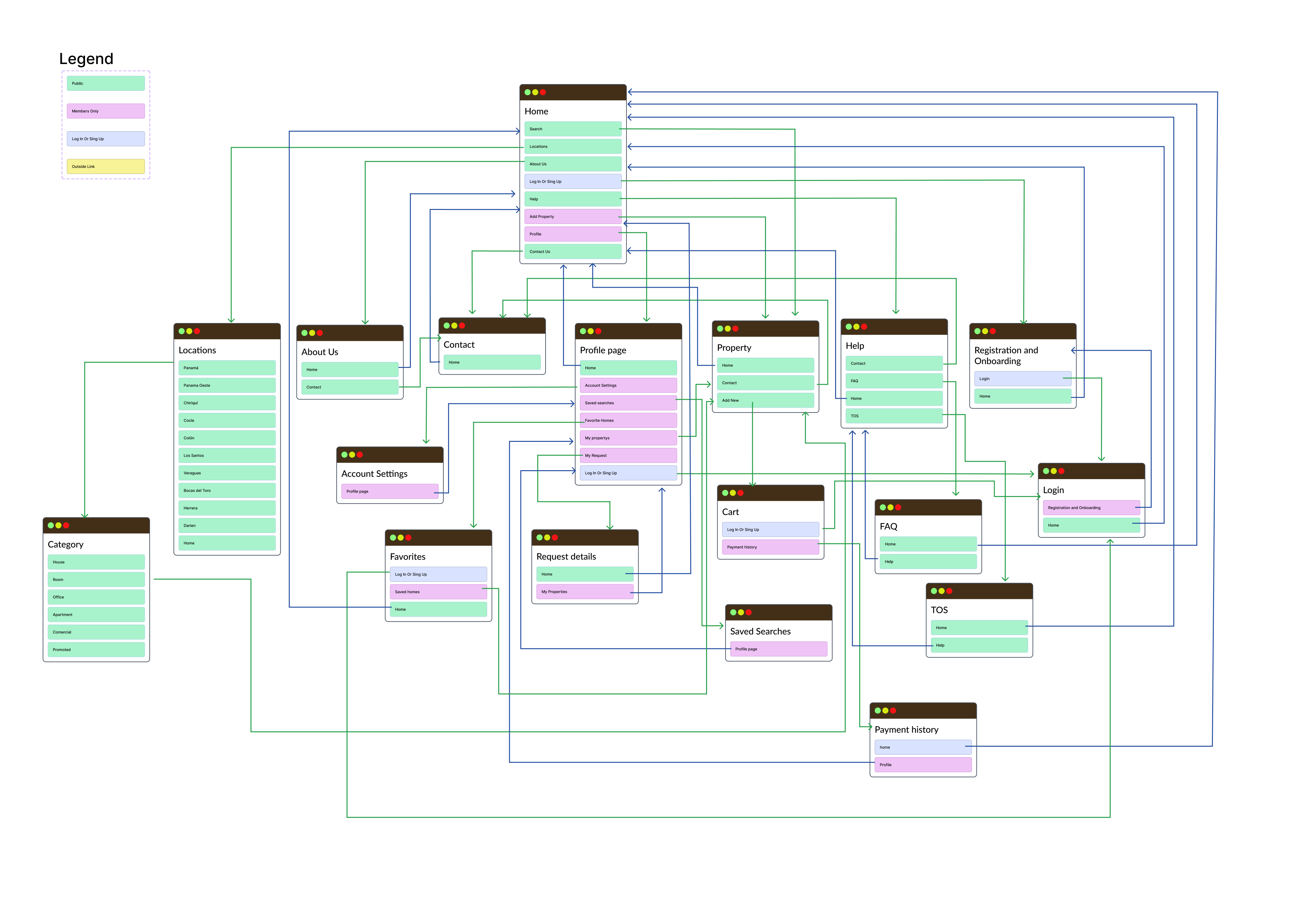
Information architecture
HiFi Prototype
To get to this Hi-Fidelity prototype, after an ideation process using crazy eight technic, I created lo-fi and hi-fi wireframes then validated the designs using usability test with my users.
Here you could see a clear idea of how the finished website should look, I use this prototype to do the second test in usability study with users.
To see the current prototype and have a better experience
Usability Test
- I conducted two rounds of usability studies. The insights from the first study helped me to guide the design from the Wireframes to Mockups and understand what were the important points that we should implement first and what could I missed.
- The second study used a high-fidelity prototype and revealed points of the design that should be improved before the final release.
Findings
Round 1
Users need clear icons and appealing graphic that makes them feel interested.
Round 2
What I learned
- I learned how a specialized product could help the users and be more useful than a general solution.
- Users need well-organized information and specific solutions to their pain points.
- I found that I could change my designs after iterations if I found better solutions to any
design options I previously suggested