Trendy Florist
A mobile app design for a Trendy Florist from L.A.
Role
UX designer, UI designer, designing an app for Trendy Florist from concept to delivery
Tool
Figma, Figjam, Notion, Zoom, Adobe Illustrator, Adobe Photoshop
Background
Trendy Florist is a local flower and gift store from L.A. They offer flowers, various gifts, and delivery to all US. They asked me to design a mobile Android app, to add value for their current users and get new users through this new project.
The Problem
The Solution
Our Trendy Florist mobile app will let busy users, order flowers and other gifts from their mobile phones, giving them the ability to make their orders from anywhere at any time in an easy a fast way.
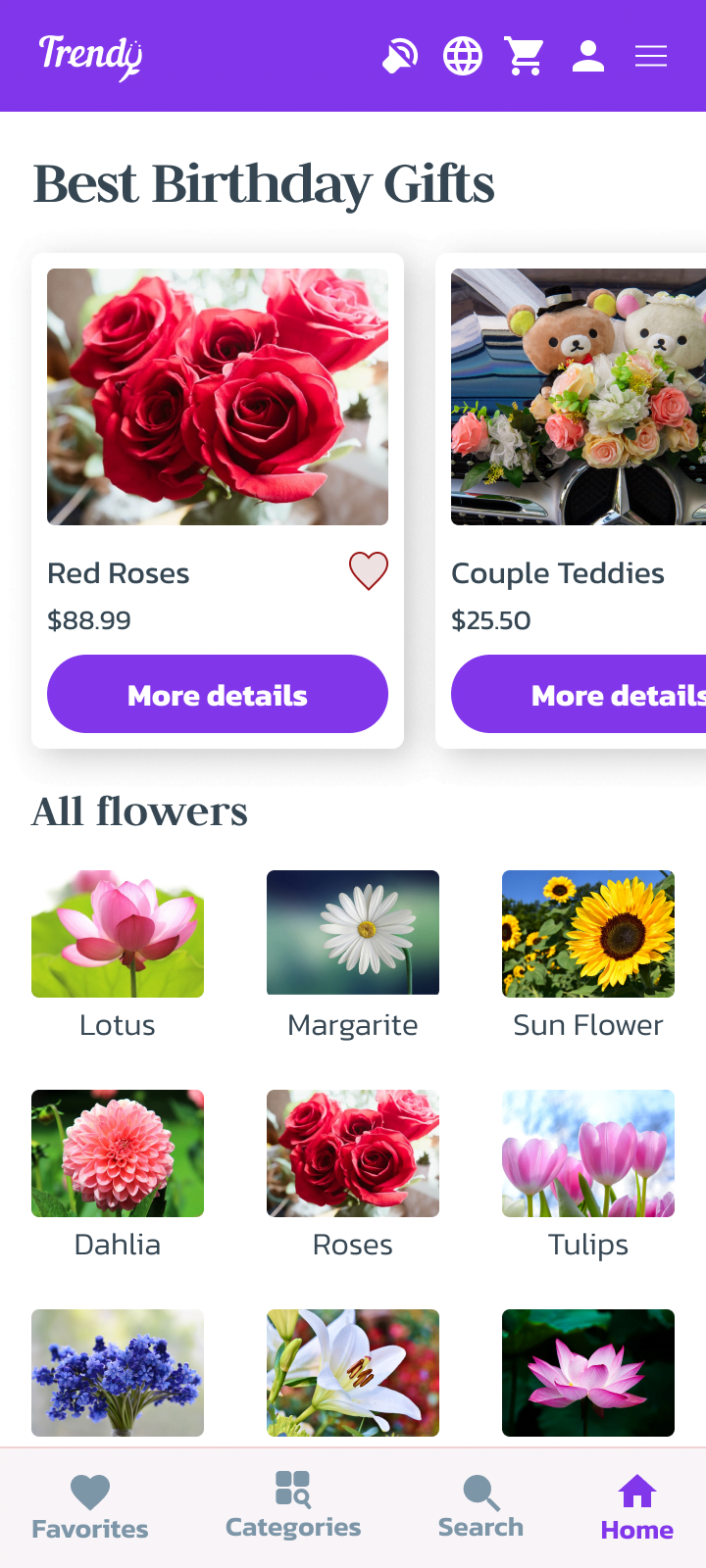
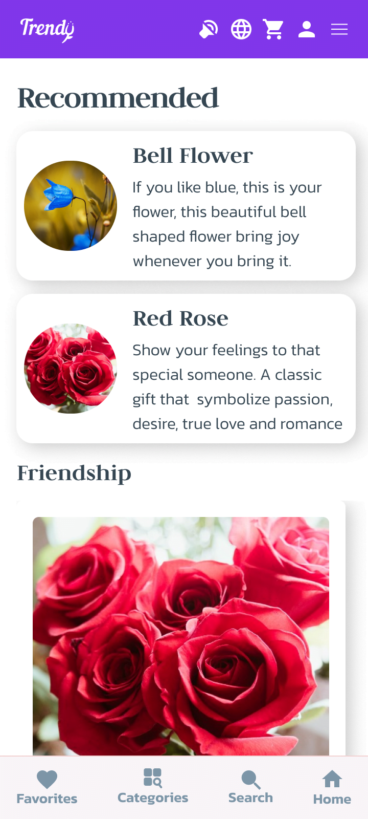
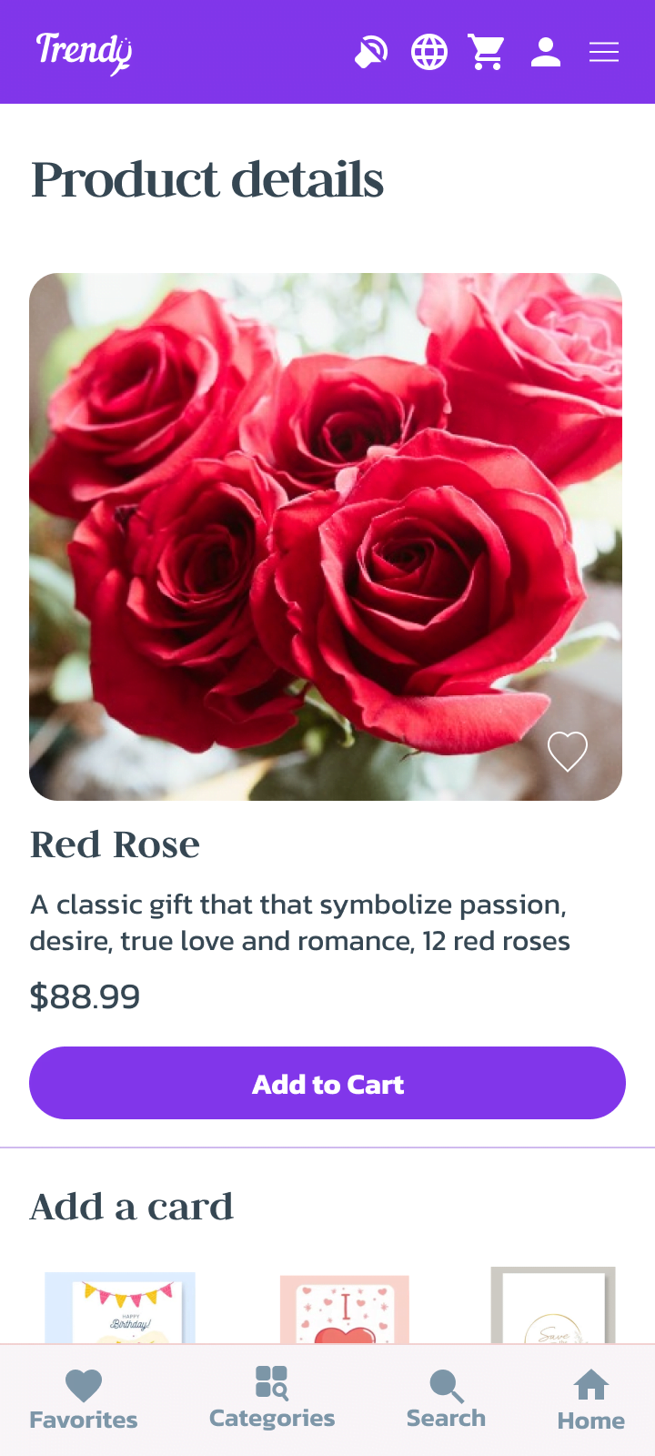
These are just some of the screens, here you can see all screens. To know my process or see the prototype please keep reading…
Research
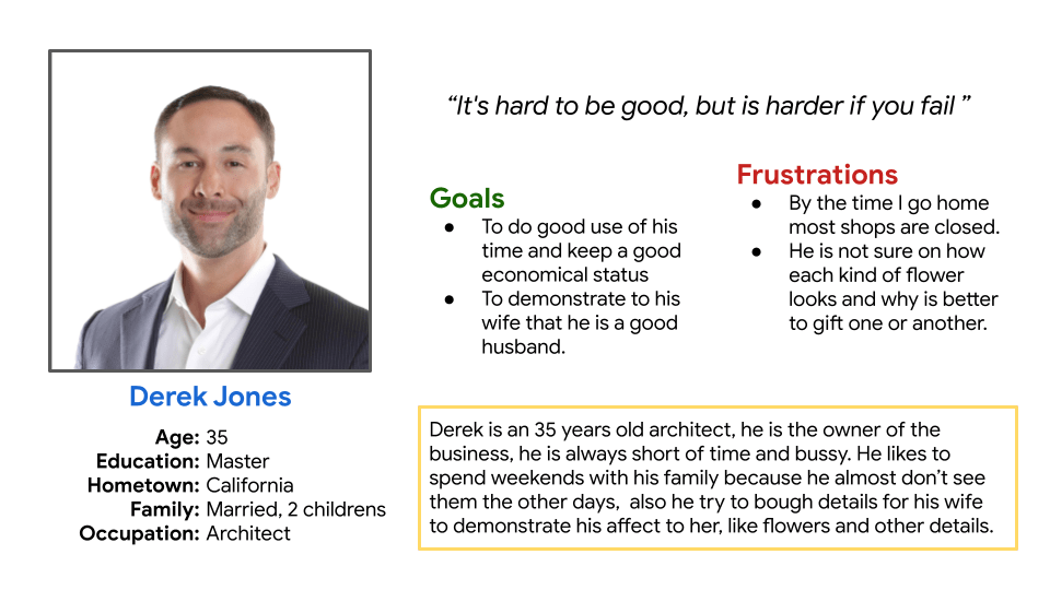
I interviewed five users, ages 18+, economically active, who buy flowers and gifts regularly, and included participants with some kind of disability. Then I created user personas based on my research insights.
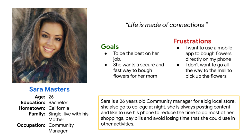
User Personas
Is very important to create user personas based on real users, and it is very helpful to keep research and design centered on our users’ common paint points and characteristics. Because of that I synthesized our interviews and created 2 main user personas based on the results of the one-on-one interviews.
User pain points
I discovered that many of our users are young professional adults ages 20 to 40 years old, with little to no free time to go buy flowers or gifts in person and they wanted a fast and easy way to get and send them to their loved ones. From my research, I finded the next pain points
Time
Busy users have little to no time to go buy flowers or gifts in person
Accesibillity
Many users want to use an app in their own language an the app should include assistive technologies
Location
People want to have an the posibility to buy from anywhere
Mobile
They want to use their mobile phones to search for flowers and gifts on the go.
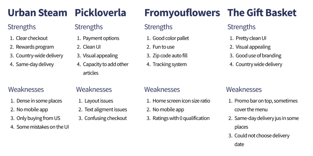
Competitive analysis
Once I found who are our competitors I analyzed and synthesized the next discoveries:
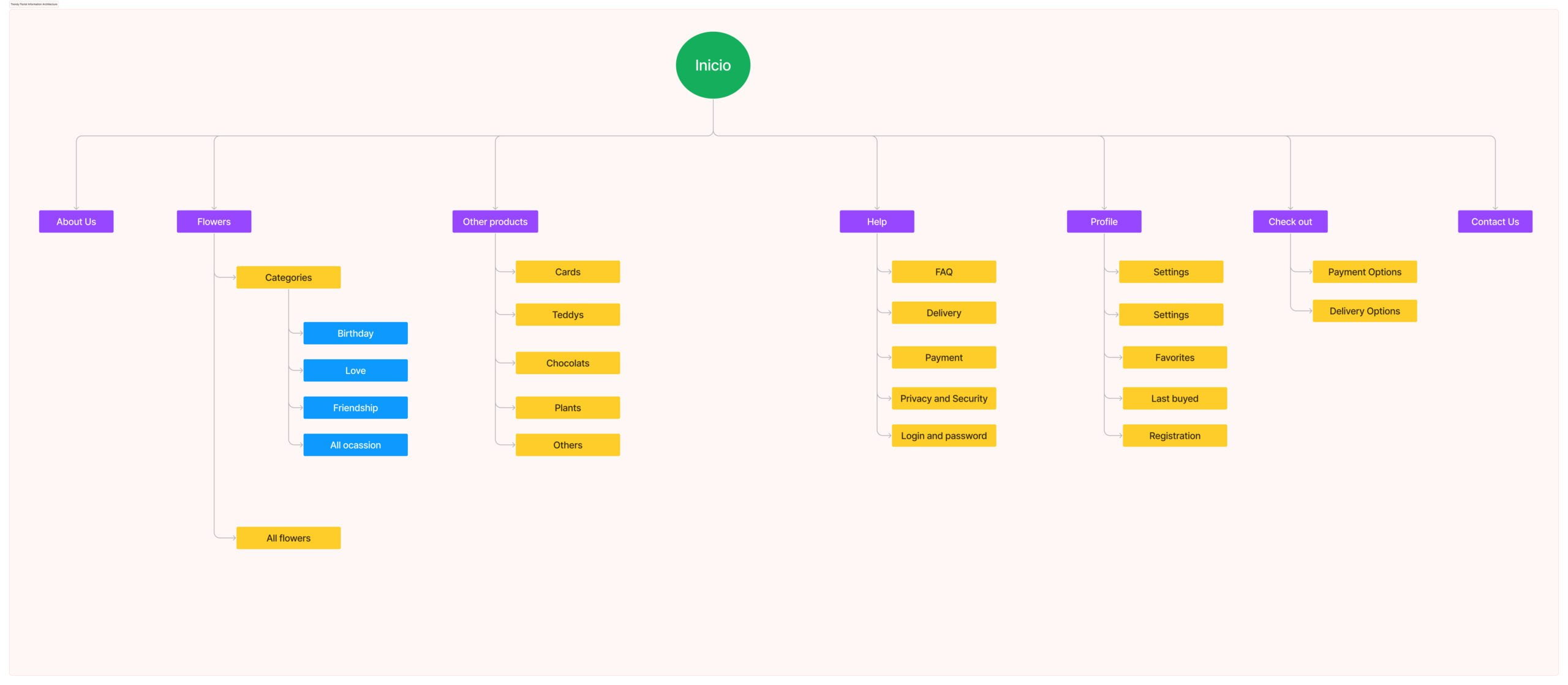
Information architecture
To be sure all the information the user needs will be present in the proposed designs, I created the information site map.
HiFi Prototype
To get to this Hi-Fidelity prototype, after an ideation process using crazy eight techniques, I created lo-fi and hi-fi wireframes and validated the designs using usability tests with my users.
This prototype presented a detailed version of app screens, allowing the user to change language options, and payment card options, add and delete products from their order, and follow the place order user flow.
Here you cour see a clear idea of how the finished app should look, I used this prototype to do the second test in the usability study with users.
Usability Test
- I conducted two rounds of usability studies. The insights from the first study helped me to guide the design from the Wireframes to Mockups.
- The second study used a high-fidelity prototype and revealed points of the design that should be improved before the final release.
Findings
Round 1
Users need a clearer option to get to the home page in any moment.
Users need icons and clearer visual cues for guidance to use the app.
Users need icons and clearer as visual cues for guidance to use the app
Round 2
Users want to add more items to the cart in the prototype
What I learned
- I learned how valuable user feedback is.
- Users show me new pain points through the usability study (to care on and don’t miss it)
- Their feedback is so important to help us understand what we should improve on our designs.